Material UI
Summary
TypeScript + tooling component library with Material UI added.
Compared to Tailwind, sharing Material UI (MUI) components is relatively straight-forward.
We're going to start with bare-ts-tooling, reusing the tsup setup.
Setting up Material UI
We will make the assumption that all applications using our MUI components will also use MUI. Therefore, we will set up MUI as a peer dependency of our library. The only difference between declaring it as a peer dependency instead of a dependency is, that the downstream application will be forced to use a compatible version of MUI. Imagine having MUI v4 in the application and MUI v5 in the library - that will cause two competing versions of MUI to be in the final application bundle.
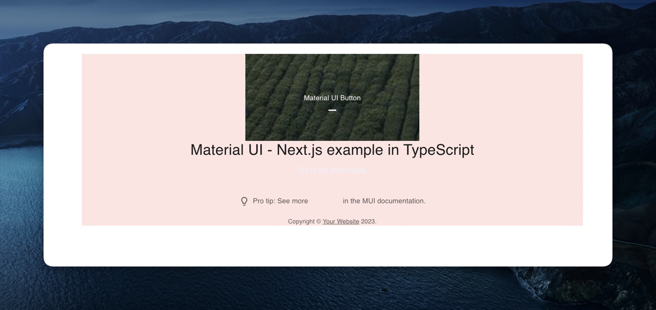
pnpm add -D @mui/material --save-peerFor our application, we're going to use next-ts example provided by MUI.
Theming
MUI provides a plethora of components - it should be obvious that wrapping every single one of them does not make any sense and is certainly not the intention of the MUI authors.
Instead, MUI provides a theming solution - by wrapping your application in a theme, you can customize all design aspects of your application. Think of it as a configuration object shared across all MUI components you use.
We will create a simple theme in src/theme.ts:
import { createTheme } from '@mui/material'

export const theme = createTheme({
  palette: {
    primary: {
      main: '#ffe4e1'
    },
    secondary: {
      main: '#edf2ff'
    }
  }
})
Additionally, we will replace the button in src/index.tsx with src/Button.tsx (see code) and adapt src/index.tsx accordingly:
export * from './theme.ts'
export * from './Button.tsx'
And that's it! pnpm build should correctly generate the contents of the dist folder.
Consuming
We can use the library theme in our applications like this:
import { theme } from 'our-library';

// Create a theme instance.
export const appTheme = createTheme(theme, {
  palette: {
    error: {
      main: red.A400,
    },
  },
});
All that's left to do is to use some component, like the fancy button in our case, and consume the theme where necessary: