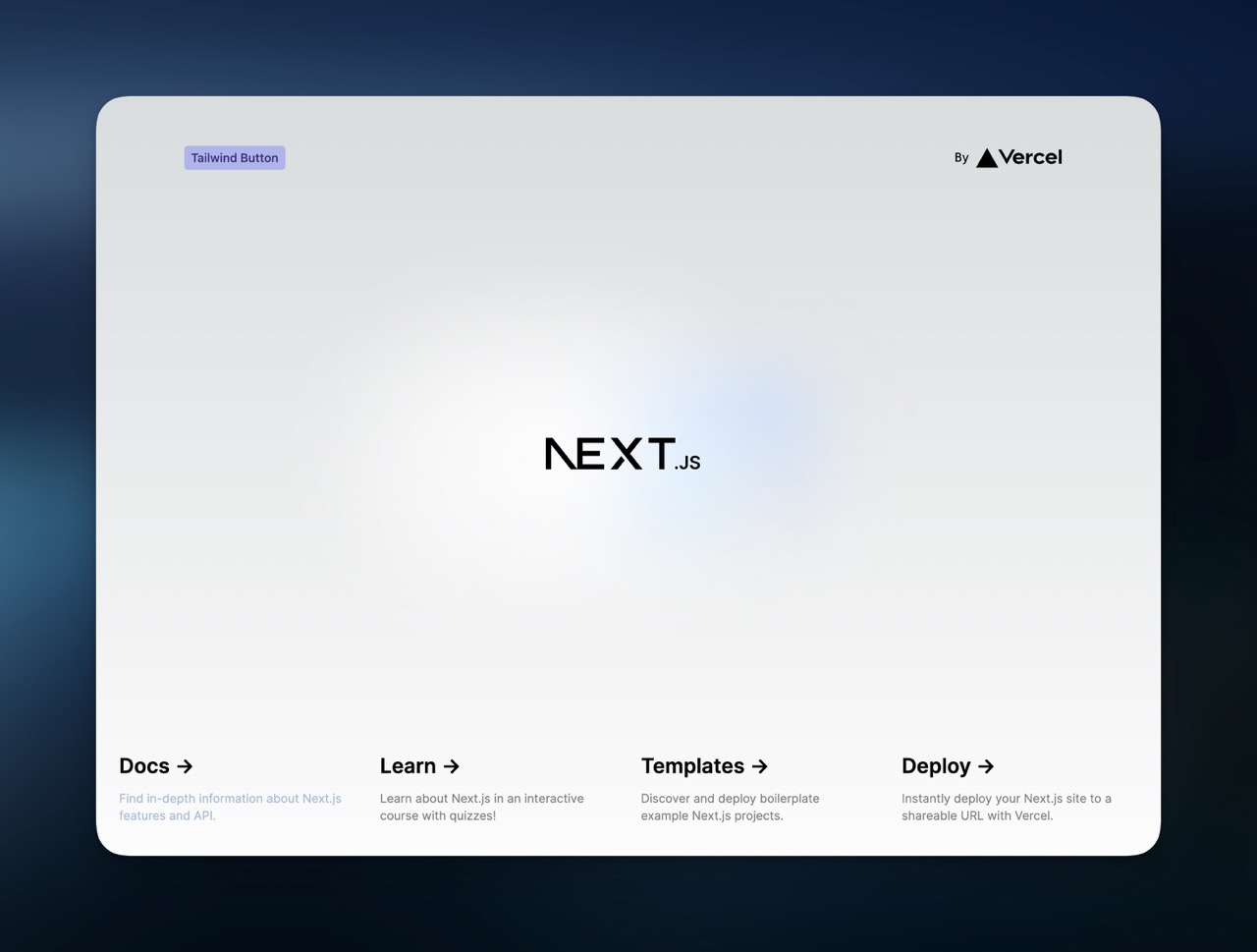
Tailwind
Summary
CSS component library using Tailwind for styling.
Before we start, our goals here are:
- allow Tailwind classes within JSX (
className="bg-indigo-400") - allow Tailwind classes via PostCSS syntax in a global stylesheet (
@apply bg-indigo-400in./src/styles.css) - allow Tailwind classes via PostCSS syntax in per-component stylesheets (e.g.
./src/button/styles.css) - expose the library's Tailwind config as a preset for downstream applications (as applications should match the theme of the component library)
Setting up Tailwind
We do the usual commands to set up Tailwind:
pnpm add -D postcss tailwindcss autoprefixernpx tailwindcss init
This creates a postcss.config.js and a tailwind.config.js. As our library is an ES module, we'll have to rename the PostCSS config to postcss.config.cjs (that's likely a bug in tsup).
As we want to expose custom theme values later, we will split the tailwind.config.js into two parts:
tailwind.base.tsincludes everything we want to share with downstream applications, like custom colors.tailwind.config.tsis the Tailwind config used by our library. It extends the base config with configuration specific to our library, likecontent.
Our tailwind.base.ts looks like this (yes, Tailwind now supports ES Module config files):
import { type Config } from 'tailwindcss'

const config: Config = {
  content: [],
  theme: {
    extend: {
      colors: {
        fancy: 'steelblue'
      }
    }
  }
}

export default config
Our tailwind.config.ts looks like this:
import { type Config } from 'tailwindcss'
import base from './src/tailwind.base.ts'

const config: Config = {
  presets: [base],
  content: ['./src/**/*.tsx'],
  corePlugins: {
    preflight: false
  }
}

export default config
As we want to expose the base config, we'll put it in src/tailwind.base.ts and export it in src/index.ts:
// src/index.ts

import './styles.css'

export * from './button/index.tsx'
export { default as tailwindConfig } from './tailwind.base.ts'
Downstream applications will be able to import the config like this:
import { tailwindConfig } from 'our-library'The rest of the downstream setup is identical to Level 4 - we import the styles by doing import 'our-library/styles' in _app.tsx.
Writing styles
Now that everything is cabled together, esbuild should correctly invoke PostCSS and extract all styles. In order to test that, we try out all possible variations:
- Inline classes
// src/button/index.tsx

import { type PropsWithChildren } from 'react'
import './styles.css'

export const Button: React.FC<PropsWithChildren> = ({ children }) => (
  <button
    className={`button bg-indigo-400/50 hover:bg-indigo-400/60
      text-indigo-900 font-medium transition hover:shadow`}>
    {children}
  </button>
)- In the component's stylesheet
/* src/button/style.css */

.button {
  @apply rounded px-2 py-1;
}- In the root stylesheet
/* src/style.css */
@tailwind components;
@tailwind utilities;

button {
  @apply font-sans;
}
The first two lines in src/style.css are required, otherwise PostCSS doesn't know what to do with inline Tailwind classes.
You might notice that @tailwind base; is missing - this is intentional, as we don't want any reset styles in our library's CSS. Otherwise, including the library CSS file after an application's CSS will reset the application CSS.
If everything works correctly, running pnpm build should yield a dist/index.css that contains classes from src/style.css (including the inline classes from src/button/index.tsx) and src/button/styles.css.

Note the steelblue text at the left bottom, using text-fancy ☺️